
Cross-Platform Responsive Design
What I Do
Ensure flawless experiences across desktops, tablets, and mobile devices with fully responsive and adaptive designs.
Tailwind CSS - React
Inside the Service
- Layouts tested and refined across mobile, tablet, and desktop breakpoints.
- Touch-friendly interactions alongside mouse and keyboard support.
- Consistent visual hierarchy regardless of screen size.
My Process
- 01
Design mobile-first, then progressively enhance for larger screens.
- 02
Test on real device sizes, not just browser dev-tools presets.
- 03
Fix edge cases: long text, small screens, and unusual aspect ratios.
See It In Action
A real project from my portfolio where this exact service was put to work.
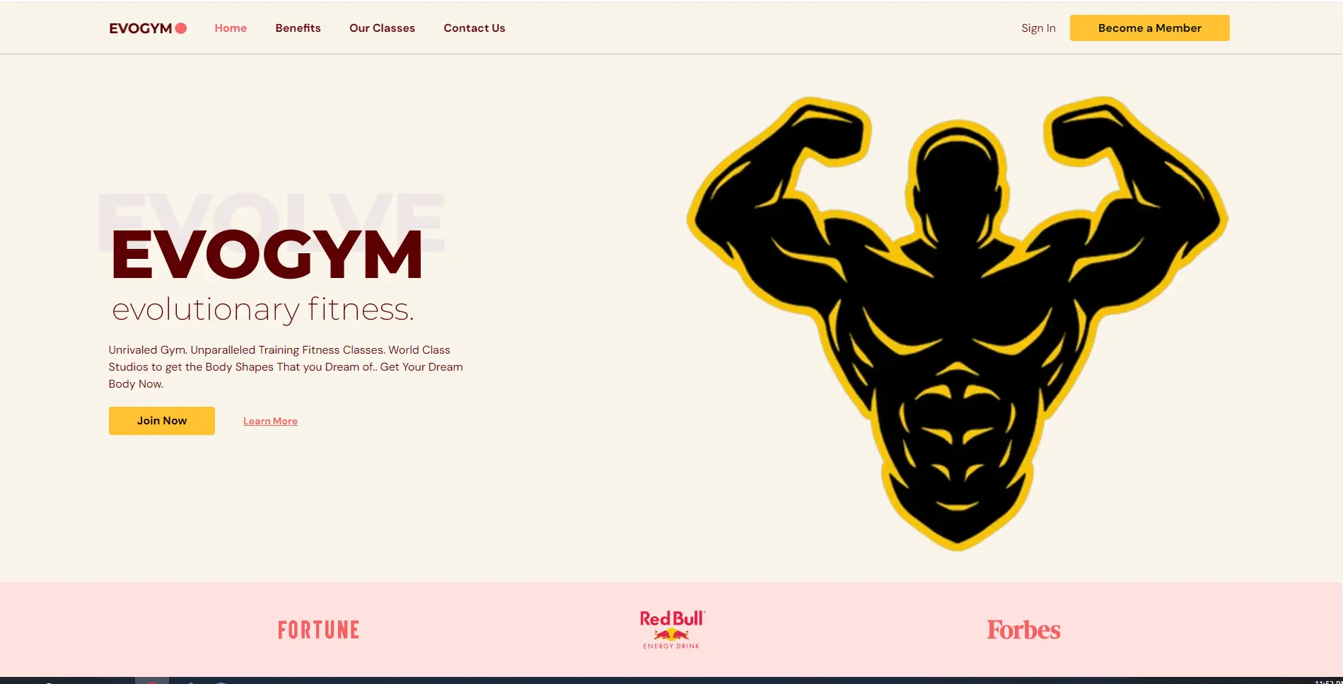
EVOGYM
Gym-related project. offering a visual feast of high-quality animation and a design that adapts seamlessly to any device.designed with a user-friendly interface that ensures a delightful browsing experience.
Key Benefits
True Cross-Device Testing
Verified on real breakpoints, not just a couple of presets.
Consistent Visual Hierarchy
The interface reads clearly whether it's a phone or a wide desktop screen.
Tools & Technologies
Technologies I rely on to deliver this service to a production-grade standard.


What You Get
- One codebase that looks intentional on every device, not a 'works okay' compromise.
Related Services
<p>Transform Figma and Adobe XD designs into pixel-perfect, fully responsive interfaces for seamless user experiences.</p>
<p>Focus on intuitive, user-centered design to ensure smooth interactions and high user satisfaction across all platforms.</p>
Let's work together
Have an idea, a project, or a challenge you want to bring to life? Let’s turn your vision into a modern, high-performing digital experience that looks great, feels effortless to use, and is built to make a lasting impact.